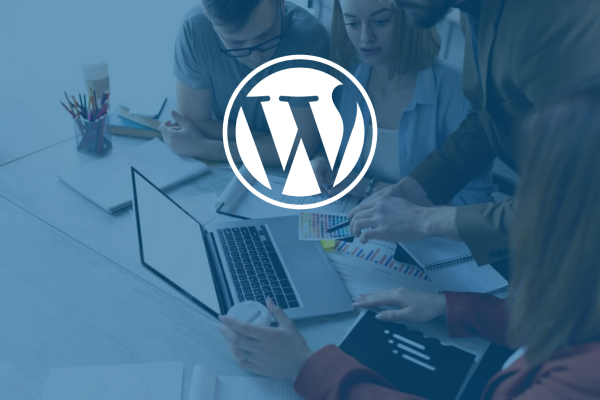
Published February 14, 2019 | Categories: Higher Education , Web Development
Happy Valentine's Day from all of us at Beacon! Many of us relish this day as an opportunity to express and share our appreciation with our partners and loved ones. We hope today is all about love for you, too.
But not all of us have that special someone to cuddle up beside this cozy, romantic evening. Not everyone is sipping champagne and eating chocolates on February 14.
For the singles among us, Valentine's Day can feel cold, intrusive and, yes, maybe even a bit judgmental. It may not be an occasion to celebrate at all. In fact, let's be honest, this day can easily bring out the sassy side of our personality.
Well, we just want to say, we hear ya. And, we'd like to put that emotional sentiment to good use. In honor of all the lonely hearts out there this Valentine's Day, here's a hate list of all the things that your favorite higher ed site might be doing wrong.
 1. Poor navigation.
Ever tried to read a map with your eyes closed? That’s what it feels like using a site that has poor navigation. We come armed with an idea of what we want to accomplish but lack of clear calls-to-action (CTA) and visual cues makes the next steps anyone’s guess. So we stumble through the site and eventually give up and leave.
A busy page isn't a good thing. It is instantly overwhelming and leaves us wondering what do we concentrate on first? Not every page needs a widget, slider, pop-ups and video. Might we suggest choosing just the features that serve the purpose of the page and calling it a day? The right tools and tasteful use of white space will often enhance the appeal of a page.
Pop-ups are universally despised and regularly misused. Nothing screams “LEAVE” louder than getting hit with the combo of a welcome message, virtual assistant and signup form all before you ever see the page content. This approach can come across as pushy and distracting, while making the back button look very appealing. Nowadays most users have ad and pop-up blockers installed to avoid being bothered. Strong CTA’s and intuitive design should be enough to guide your audience to their goals.
 4. Not mobile-friendly.
Few things will make a user rage-quit faster than having to execute the zoom-and-pan method to see your content. Even search engines are annoyed by pages that do not provide a mobile-friendly experience. So much so, that Google will exclude websites from mobile search results that they see unfit to use with smartphones and tablets. Mobile-friendly sites aren’t heavily adorned with fancy features, but they work. And consistent functionality on all our devices is all your users ask for.
This feature is SO 2016. Your entire site doesn't need to be one page. They do include page breaks in word processors for a reason. Pages that don't end are annoying. A few seconds of scrolling makes it clear that what we are looking for may be there, but it won’t be easy to find. If we are determined to find what we need we might use your search bar. But most likely we are going to do business elsewhere and save ourselves the headache and hand cramp.
Is there anything that shatters the illusion of authenticity quicker than the realization that you saw the same perfect, beautiful, smiling face on another website? Image search is a thing... passing off models as your students isn't as easy anymore. Yes, it may be easier and cheaper to just buy photos from a pic farm. But your site is better served by pictures of your real students, doing real things on your real campus.
Please stop doing this. Unsolicited videos are notorious for striking when there are no headphones to be found, in a quiet area, when we least expect it. We scramble, panicked and embarrassed, to find the offending page and close it immediately. Who cares what was on the page? Your users are now super annoyed... and gone.
These days, we all live for and love instant gratification. So, when a website takes more than five seconds to load, we are likely already on to the next thing... or we want to be. Large files and lengthy auto-play videos are often the culprit behind glacial loading times. These page additions typically aren’t crucial to the overall experience and are hindering your users from getting to the content they came for. It's even more important for mobile pages to be super fast.
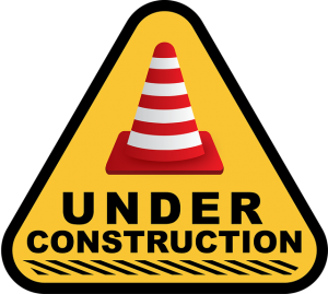 9. Broken links.
Broken links are like an "Under Construction" sign in the middle of a beautiful museum exhibit. They ruin the aesthetic of your site, and if there are too many of them, they also ruin user experience and your ranking potential. You can't always avoid 404s on your site. But, in the least, you should have a plan in place to regularly monitor for broken links.
This has been a hot topic in website design circles in recent years, and one close to our hearts. Not meeting accessibility standards reduces your site usability for people with disabilities. Your site may be a work of pure design genius, but you'll definitely lose brownie points if not everyone can read or use it. And search engines will ding you for it, too. Poor contrast choices, limited keyboard accessibility, lack of alt tags and open/closed captioning for videos all impede users' ability to fruitfully navigate your site.
Is your higher ed site guilty of some of the above offenses? Not to worry. Beacon can bring the love of your prospective students back to your webpages. Request a free website audit today.